As I began to write this blog, Weebly gave me the following placeholder text at the top of the page.

Those little dots are all over the place!
Let’s get to know them better, shall we?
What is an ellipsis?
An ellipsis (plural: ellipses) is a punctuation mark comprising three periods in a row. (Whether or not there are spaces between these periods is a matter of style. More on that later.)
I learned from Keith Houston in his wonderful book Shady Characters that the word “ellipsis” comes from the Greek élleipsis, meaning “to fall short” or “to leave out.”
How is the ellipsis used?
I’m so glad you asked. It can perform a few different tasks, outlined below.
An ellipsis can communicate a “trailing off.”
In this case, the ellipsis can act with the sentence-terminating power of a period. No additional period is necessary, and the subsequent sentence begins with a capitalized letter.
Where the heck is my wallet? I had it when I was leaving the bar. I put it on the roof of the car, and … Oh, no.
If you need that trailed-off sentence to be question-esque, then pop a question mark on the end.
Could this ice pick be the one that was used … ?
Similarly, if you need to get exclamatory, add an exclamation point.
What do you mean, you’re my boyfriend’s wife? You can’t possibly … !
An ellipsis can be used mid-sentence to convey faltering.
I didn’t lie under oath, exactly … I mean … I was being … poetic.
Let me point out here: Practically every writing authority says you should seriously try to avoid these “pausing ellipses.” Evidently, they’re annoying to read. You (and I) have been warned.
An ellipsis can say, “Text has been removed from this spot.”
This is really the primary job of the ellipsis.
If you pull out words from the middle of a sentence, you can indicate it like this:
A witness stated, “I saw the … spaceship land right on the polo field.”
Or let’s say you had a three-sentence quote and removed the middle sentence (“Its fleece was white as snow,” here):
“Mary had a little lamb. … Everywhere that Mary went, the lamb was sure to go.”
Notice how right after the word lamb, there’s:
You don’t typically need an ellipsis at the beginning or end of a quotation.
In Lapsing into a Comma: A Curmudgeon’s Guide to the Many Things That Can Go Wrong in Print—and How to Avoid Them Bill Walsh makes this curmudgeonly point: “It’s silly to indicate omission at the beginning or end of a quote, since virtually all quotes are from people who have spoken before in their lives and will do so again.”
Obviously—and importantly—you never want to misrepresent anyone’s sentiments, but if you eliminate the beginning of their sentence without changing the intended meaning of the quote, you can then portray the truncated sentence with a capitalized “first” word.
For example, if in real life I rhapsodize, “I love cauliflower so much that I believe it is a perfectly good choice for breakfast,” then the journalist following me around might quote me this way: “Cauliflower … is a perfectly good choice for breakfast.”
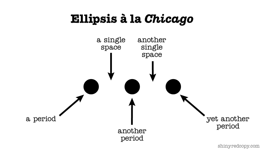
The interior life of an ellipsis: Should there be spaces in there?
Most of the resources I use, including my go-to Chicago Manual of Style, say that you should put a single space between each of the three dots, like so:
Let’s get to know them better, shall we?
What is an ellipsis?
An ellipsis (plural: ellipses) is a punctuation mark comprising three periods in a row. (Whether or not there are spaces between these periods is a matter of style. More on that later.)
I learned from Keith Houston in his wonderful book Shady Characters that the word “ellipsis” comes from the Greek élleipsis, meaning “to fall short” or “to leave out.”
How is the ellipsis used?
I’m so glad you asked. It can perform a few different tasks, outlined below.
An ellipsis can communicate a “trailing off.”
In this case, the ellipsis can act with the sentence-terminating power of a period. No additional period is necessary, and the subsequent sentence begins with a capitalized letter.
Where the heck is my wallet? I had it when I was leaving the bar. I put it on the roof of the car, and … Oh, no.
If you need that trailed-off sentence to be question-esque, then pop a question mark on the end.
Could this ice pick be the one that was used … ?
Similarly, if you need to get exclamatory, add an exclamation point.
What do you mean, you’re my boyfriend’s wife? You can’t possibly … !
An ellipsis can be used mid-sentence to convey faltering.
I didn’t lie under oath, exactly … I mean … I was being … poetic.
Let me point out here: Practically every writing authority says you should seriously try to avoid these “pausing ellipses.” Evidently, they’re annoying to read. You (and I) have been warned.
An ellipsis can say, “Text has been removed from this spot.”
This is really the primary job of the ellipsis.
If you pull out words from the middle of a sentence, you can indicate it like this:
A witness stated, “I saw the … spaceship land right on the polo field.”
Or let’s say you had a three-sentence quote and removed the middle sentence (“Its fleece was white as snow,” here):
“Mary had a little lamb. … Everywhere that Mary went, the lamb was sure to go.”
Notice how right after the word lamb, there’s:
- a sentence-ending period
- a standard après-period (single) space
- the ellipsis, announcing a missing chunk of text
- another space (more on that below)
- another complete quoted sentence (which begins with a capital letter, as all sentences should)
You don’t typically need an ellipsis at the beginning or end of a quotation.
In Lapsing into a Comma: A Curmudgeon’s Guide to the Many Things That Can Go Wrong in Print—and How to Avoid Them Bill Walsh makes this curmudgeonly point: “It’s silly to indicate omission at the beginning or end of a quote, since virtually all quotes are from people who have spoken before in their lives and will do so again.”
Obviously—and importantly—you never want to misrepresent anyone’s sentiments, but if you eliminate the beginning of their sentence without changing the intended meaning of the quote, you can then portray the truncated sentence with a capitalized “first” word.
For example, if in real life I rhapsodize, “I love cauliflower so much that I believe it is a perfectly good choice for breakfast,” then the journalist following me around might quote me this way: “Cauliflower … is a perfectly good choice for breakfast.”
The interior life of an ellipsis: Should there be spaces in there?
Most of the resources I use, including my go-to Chicago Manual of Style, say that you should put a single space between each of the three dots, like so:
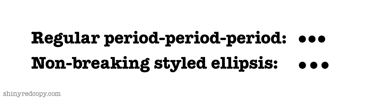
But if you do that for self-published online writing, you’re liable to end up with an occasional bad line break, with one or two dots at the end of one line and the remainder on the next—a bad look. Here’s one solution: Insert a non-breaking space before every dot to ensure the whole bunch stays together. To create a non-breaking space:
You might be better off using the AP’s ellipsis style (like I’m doing in this blog), which dictates three dots in a row—no spaces between them. Now, when I type three consecutive periods on my Mac, a nifty thing happens: My three dots magically transmogrify into a solid ellipsis. It has a smidge of non-breaking space (but not quite a full space) in between its three dots, and they stay together, never to be separated. You can see a difference, if barely:
- On a PC, type ctrl + shift + space.
- On a Mac, type option + space.
You might be better off using the AP’s ellipsis style (like I’m doing in this blog), which dictates three dots in a row—no spaces between them. Now, when I type three consecutive periods on my Mac, a nifty thing happens: My three dots magically transmogrify into a solid ellipsis. It has a smidge of non-breaking space (but not quite a full space) in between its three dots, and they stay together, never to be separated. You can see a difference, if barely:
In places where this doesn’t happen automatically, I can type option + semicolon on my Mac to achieve it. The internet tells me that on a PC, you can hold down the alt key while typing 0133, or if you’re in Word, you can type ctrl + alt + period.
Oh, yay: a bizarre exception.
Just when I thought I had the two ellipsis styles (gapped and non-gapped) straight, I read this line from Bill Walsh in Lapsing into a Comma: “In headlines, … I prefer, like many publications, to omit the spaces between ellipses entirely.” Everywhere else, though, he puts spaces between the dots.
Neat, huh? The authorities swing from one ellipsis style to another if it suits them.
Relevant aside: I removed words from the middle and the end of Walsh’s complete quote above, but I didn't change his meaning.
Swaddle your ellipses in space.
Interior space is one thing; exterior space is another. The ellipsis is kind of standoffish most of the time. It likes to have a single space to its left and and a single space to its right in almost every scenario. Check out all the characters an ellipsis buffers itself against with a space.
The comma:
“I turned on the light, … and then I realized the kitchen was filled with raccoons.”
The semicolon:
“Randy knew he had to redeem himself … ; he spent the weekend cleaning the gutters, the windows, the chimney, and his text history."
The colon:
“Here is what I want … : a martini, a cigar, and several more martinis.”
The exclamation point:
Her eyes took on the shape and size of hubcaps as she uttered, “You can’t seriously … !”
The question mark:
“But Sally,” lisped her little brother, “how could the Tooth Fairy know … ?”
Words:
As you can see in all my examples in this blog, there’s always a space between an ellipsis and the nearest word.
The only creature an ellipsis seems willing to allow to get close to it is a quotation mark.
Lady Gaga shot back, “If I had a dollar for every time someone …” Then she took a deep breath, exhaled slowly, and strode away.
In UX/UI, spaceless seems to be the style.
On websites these days, we’re often coaxed to “continue reading” or to proceed further down some marketing funnel. This generally happens with a brief piece of text followed immediately by an ellipsis—with no spaces whatsoever.
In fact, on the AP Stylebook website, just beneath its guidance to put a space on either side of an ellipsis, there’s this flagrant contradiction:
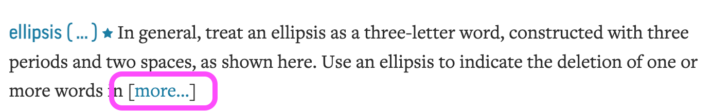
Similarly, the marvelous Grammar Girl, Mignon Fogarty, has a great article about ellipses. In it, she points out how ellipses always have spaces around them. And right beneath her article, there’s this:

In conclusion …
In “real” writing (no need to fret about your texts and DMs, and UX/UI seems to be a renegade universe):
In “real” writing (no need to fret about your texts and DMs, and UX/UI seems to be a renegade universe):
- Consistency is queen. Decide how you want to approach ellipses and then stick with your approach.
- Don’t let your ellipses get torn asunder. Keep those three dots together. Don’t let a line break separate them.
- If looks matter, take extra care. If you’re doing actual typesetting in Canva or similar, don’t let a line break push an ellipsis to the beginning of a line.
- Ellipses are standoffish. You almost always want a space on either side of your ellipses.
Affiliate link alert: The two books mentioned above include affiliate links. And I’ll give you a few more, with these resources I consulted while writing this piece:
- Common Errors in English Usage by Paul Brians
- Dreyer’s English by Benjamin Dreyer
- Garner’s Modern American Usage by Bryan A. Garner, though you might be better off with his newer Modern English Usage
- The Gregg Reference Manual by William A. Sabin, also now available in a later edition
 RSS Feed