Sara Rosinsky • Shiny Red Copy
  • home
  • about sara
  • speaking
  • blog
  • portfolio
    • social media
    • articles
    • dandy candy
    • freezer treats
    • money matters
    • online ordering
    • raise a glass
    • fundraising
    • hair we go
    • education
    • branding
    • thinq smart
    • how entertaining
    • spread the word
    • a few faves
    • sears screed
  • kudos
  • unflubbify
  • freebies
    • resources
    • word search
  • store
  • contact sara
  Sara Rosinsky • Shiny Red Copy

sara's Shiny red blog

Why it took me a year to design a logo (and what the experience taught me).

4/18/2020

5 Comments

 
Picture
Logos I did *not* design. From left to right, designed by Saul Bass, Saul Bass, and Rob Janoff.
Congratulate me. Seriously. I deserve it.

This week, I finally gave a client a logo I started working on—yes—one year ago.

Want to know why? Because I am not a professional designer.

Why, you may ask, would I create a logo for a client if I am not a designer?

Excellent question.

The answer can be found somewhere in the neighborhood of “enthusiasm” and “curiosity.” Cross street: “naïveté.”

When I began freelancing (as a copywriter, not a designer) in 2016, I quickly decided that I wanted to learn how to use Adobe Illustrator (and maybe a few other applications in Adobe Suite). I started watching instructional videos and practicing and slowly, slowly acquiring knowledge.

But I realized I needed a professional to occasionally lean over my shoulder and give me some guidance. So when a “branding design” class opened up nearby—taught by a creative director I really admire—I paid for it within approximately two minutes and eagerly awaited the first class.

I was going to get to work on logos! Color palettes! Typography! With professional guidance!

The class convened. And it wasn’t quite what I was expecting. We focused a lot on positioning and strategic branding. We worked on articulating brands with words much more than with design. 

But at a certain point, I was given the assignment to develop a brand, complete with logo.

Rather than work for an imaginary client, I thought I’d try to help out a nonprofit. I found one right in my town, met with the managing director, and got going. After some preliminary work, it came time to create … the logo.

The creative director/teacher of my branding class gave me very friendly feedback on the designs I shared, but I could tell he was being way too forgiving. I knew I wasn’t finished with the logo by the time the class concluded.

I kept working. I got help from several designer friends. And eventually, with MUCH assistance, I came up with half a dozen logos. The client chose one, and just this week, I finished creating all the requisite formats, zipped the file, and sent it off. Ta-da!

Now, let me say that part of this year-long logo turnaround has to do with the nonprofit I worked with—how infrequently their board meets, and a definite lack of urgency on their end. But a big part of it has to do with how freaking difficult it is for a non-designer to create a logo.

Yes, I’ve worked closely with professional designers for 30 years. I’ve attended countless design conferences and events. I’m a member of AIGA. I know *something* about design. But I did not earn a degree in design. And this became painfully obvious. Because designing a logo is challenging in about a dozen different ways. And every challenge was amplified by my ignorance.

I learned a lot from this adventure, to be sure. But I won’t enumerate all the lessons I absorbed about typography alignment and CMYK values and Pantone workarounds and EPS files. Instead, I want to tell you my most important takeaways from my Very Challenging Logo Project.

My Three Commandments for Hiring Designers

I’ve felt all of these things throughout my career. But never so strongly as I do now. 

1) Give designers plenty of time.

​Most non-designers have a drastically skewed view of how long it takes to do anything design-wise. The advent of Photoshop contributed to this misperception. Non-designers think everything should take just a few keystrokes to accomplish. Never assume any such thing. Every aspect of design—researching, concepting, creating, tweaking, reviewing, etc.—takes time. Practice saying this with me now so you can say it to your designer later: “How much time do you need?”

2) Give designers plenty of money.

If you are a non-designer, I promise you this: Your designer knows more than you do about design. Designers have worked hard to become educated and savvy professionals. They are artists. They are technicians. They are problem-solvers and problem-preventers. They know how to help you. They are worth every penny. Pay them. Pay them well. Pay them on time.

3) Give designers plenty of respect.

I’ve been in the advertising/marketing business long enough to know that this needs saying. Repeating. Yelling. It’s closely tied with items #1 and #2 above. Don’t impose ridiculous deadlines. Don’t ignore invoices. Don’t wait until the last minute to answer questions. Don’t request changes because your wife doesn’t care for the color green. In fact, if you’re going to request any changes, preface them with this: “Let me know if you think this will compromise what you’re trying to accomplish with your design. If so, let me know. Please tell me what you think.”

Now. Does anyone need a logo? Because I know quite a few designers I’d be happy to recommend.

5 Comments

What if?

3/8/2020

3 Comments

 
Picture
I have this idea. People may not like it.

Here's what I'm thinking: The world is not black and white. People are not all good or all bad. I know how much we love having villains and heroes, but that really isn't the way it works.

Think of your personal life. Those times when someone's behavior enrages you, you typically aren't really understanding their perspective or rationale. You make assumptions. You simplify. You get self-righteously pissed off.

But after the blow-up, the yelling, the tears, the silent treatment... if you're lucky, you talk. You listen. And you come to understand. More often than not, you realize that your fury wasn't really so appropriate.

What I want is a number. A number that represents how likely your perspective is to be accurate in any of those times you find yourself indignant. If your perspective were perfect during these moments, this number would be 100.

The number could never be 100.

It is my hypothesis that when we find ourselves angry—at a spouse, at a relative, and yes, even at a ideological adversary or politician—this number, on average, is 24.7—at most. Maybe it's 17.9. Or lower.

Let's call that average the Righteousness Quotient. Every time you find yourself upset about someone else's behavior or beliefs, you know that you're only this likely to be correct in all your assumptions.


My hope is that, if we all knew this number, we'd be a little more patient and circumspect. A little slower to react. A little more inclined to listen and understand. Less likely to go on the attack and dig in our heels.

I think we'd all be happier. Less angry, certainly. We'd probably spend less time excoriating one another. We'd spend less energy whipping up others to share in our fury. We'd think of this number—maybe some of us would even tattoo it on the backs of our hands—and we'd remember to slow down and ask questions and work to understand one another.

I think it might make for a better world.
3 Comments

For the love of small spaces.

11/24/2019

2 Comments

 
Picture
When I was a kid, I had the opposite of claustrophobia. I'd call it claustrophilia, but I don't want to pathologize it. I just enjoyed tucking myself into little hideouts and cozy spots: cabinets, closets, an oversized drawer... even the top of the refrigerator, for a spell. (Maybe I don't want to scrutinize this behavior too much.)

Anyway, this proclivity has carried over to my professional life today. I've discovered that my favorite copywriting challenges are those where space is limited. A billboard that people need to take in while driving 70 miles an hour. A thirty-second radio spot. A digital ad that's half the size of a credit card. The back of a frozen entree. Subject lines. Headlines. Taglines. Tweets.

Related: For the past few years, I've been creating little language lessons about grammar, spelling, punctuation, etymology, etc. (See a sampling below.) Each of these social media posts measures only 1080 x 1080 pixels. That's not a lot of room to explain when you should use "loath" instead of "loathe," or how to avoid committing a comma splice. But that restriction is a big part of why I love creating these things. They're like Rubik's cubes. The challenge: How much memorable information can I fit into the square without it feeling like a Dr. Bronner's label?
Now, If you're one of the millions of people who freelance, you've likely heard the mantra that to succeed, you need to "niche down." (Don't ask me to say that out loud—whichever way you pronounce it, you're sure to annoy somebody.) The more specific your expertise, say all the career coaches, the better. You're supposed to specialize in some industry "vertical": dentistry, landscaping, badminton... something.

But I don't want to. I love promoting all sorts of products and services: beer and banks and boarding schools. If I particularly love the work a client does (like Invest in Girls, say), then that's just icing on the cake. (Oh—I've gotten to write lots about cake. And icing.)

So I think that rather than niching down in the usual sense, I'd like to focus on small spaces. I'll take a pass on the long white papers and ebooks. Bring on the ads. The emails. The out-of-home. I want to work on posters and postcards and packaging. Give me a small space, and I will do big things.℠ 
2 Comments

Have you ever suffered from semantic satiation?

9/22/2019

8 Comments

 
Picture
Just now, I was working on an email that includes a lesson about when to use "awhile" and when to use "a while." And after... well, a while, that "while" and "awhile" business started to look mighty weird. Almost like they weren't words at all but just a meaningless collection of letters.

If you've ever experienced such a phenomenon, then you've felt semantic satiation. Instead of paraphrasing the Wikipedia article, I will simply point you there, should you want to learn more about it.​
​If you find this sort of thing entertaining, do check out the related entry about the following, which is a truly legitimate sentence:

Buffalo buffalo Buffalo buffalo buffalo buffalo Buffalo buffalo.
Brown bird on top of black buffalo
Photo by Lewie Embling on Unsplash
​If you didn't know the sensation of semantic satiation before, I'll bet you do now. :)
8 Comments

An afternoon with Aaron James Draplin.

9/19/2019

3 Comments

 
Picture
Four of the postcards in the Aaron James Draplin collection by French Paper. Artists are, from left to right, Nick Hafner, Shreyas Chaudhary, Nicholas Huggins, and Levi "Tron" Ratliff.
I am a copywriter, not a designer. But back in 2016 when I started freelancing full-time, I decided that I wanted to learn how to use Adobe Illustrator. I couldn't exactly justify it, but the urge was strong enough that I started paying a hefty chunk of change for an Adobe Suite subscription.

Copywriting always comes first, but whenever I can, I take Skillshare classes* and practice using Adobe Illustrator. One of the first classes I took was taught by Aaron Draplin. He was blazingly fast, but I did my best to follow along. Everything he did was captivating and inspirational.

When I learned that he was going to be giving a workshop in Denver this week, I thought, "What the heck—why not?" I whipped out my credit card and got my spot in a class that sold out in just a few days. It was well worth the price to get in-person teaching time from the guy who's created designs for the likes of Target, Nike, Bernie Sanders, and the US Postal Service.

My dream was that he could give me some one-on-one guidance on a logo I volunteered to create for a local nonprofit. Working on this thing has proven to me that everyone should pay good designers all the money. If you've ever gotten the impression that graphic design is easy or quick, you are woefully mistaken. It is seriously challenging, and it takes time. Lots and lots of time.

Well, at yesterday's workshop, I quickly realized that there could be no personalized guidance from Mr. Draplin. There were way too many people and not enough time. But I learned a lot, and I feel more at ease about finishing up my logo. (Fortunately, I know several talented designers who are willing to help me along.)
Picture
The night before my workshop, I attended a talk that Aaron Draplin gave as part of Denver Startup Week. I bought his book...
Picture
... and got it signed. He may not have spelled my name correctly (almost no one does), but he did give me a multitude of exclamation points!!!
Many years ago, I heard someone say that "you regret things that you don't do more than things that you do." So, though it may not make obvious sense for a non-designer like me to take design classes from a big-time pro and try my hand designing a pro bono logo, that's the path I've decided to take. And I'm loving every step of it.

​Viva freelancing!

*I highly recommend Skillshare--
here's a code for two free months of a Premium subscription​.
3 Comments

Oh BOI, oh BOI.

9/16/2019

0 Comments

 
Picture
Note to self: Do not waste the reader's time by beating yourself up about how long it's taken you to write this blog. No one cares but you.

OK. So.

This summer I decided to take a trip to Boise. (Which—side note—the locals pronounce with a sibilant "s": "BOY-see.")

"Why do you want to go there?" many people asked, including my husband.

Let's see: Because I've heard lots of good things about it. Because I could get a direct flight on my favorite airline, Southwest. Because I've never been there before and now that I'm living in Colorado, it's pretty darn close. Mostly, because I'm a freelancer, and so I CAN.

So I got a flight, arranged a handful of meetings with Boise folks who might need a copywriter, booked a tiny little Airbnb house, and rented a car.

To my frustration, my workload burgeoned during this trip, so I spent many, many hours at the kitchen table of my Airbnb typing out persuasive prose. But I also managed to get out and about a bit. Here are a few of the things I enjoyed. 
Scrubby scenery with dry grass and a dirt path in Boise.
Sign: Please be Advised: Coyotes in Area Protecting their Pups / Please keep your dogs leashed
Sign: Shooters: If you brought it or shot it, remove it.
Adult quail and five or six baby quail.
Didactic from Boise Botanical Gardens with an excerpt of Meriwether Lewis's writing about how Sacagawea showed him a fennel root that will "dispell the wind" caused by some other food.
Gravestone of a prisoner at Boise's prison: "In Memory of Bud Ray, Age 19 Years, Died July 21, 1898.
Cagelike cells in the old part of the Old Idaho State Penitentiary.
Large, ornate 19th-century safe, approximately the size of a doorway.
Birdhouse on the outside of a prison window.
Street art in Boise's Freak Alley: Large face of menacing wolf on a set of double doors.
Street art in Boise's Freak Alley: stylized fierce mermaid and fish.
Painted on brick wall in Boise: a vintage ad for a Stearns car.
In addition to exploring and taking these photos, I learned the following about Boise.
  • Lots of folks fleeing San Francisco's ridiculously expensive real estate situation have moved to Boise and hiked up prices.
  • Not a lot of bumper stickers in this town.
  • No shortage of Caucasians.
  • Boise has an enclave of Basque people. Next time I go, I will need to visit the Basque Museum and Cultural Center.
  • Boise has license plates that say, "Famous Potatoes."

To me, traveling is one of the greatest perks of freelancing. Next stop: Austin!

0 Comments

I'm gonna sit right down and write myself a letter.

7/9/2019

2 Comments

 
Picture
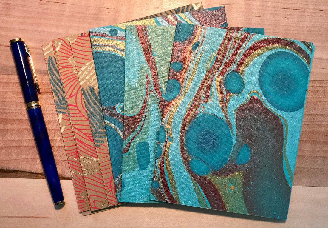
Isn't this stationery gorgeous? It's handmade, from Two Hands Paperie in Boulder, Colorado.
That's the name of a 1935 song I've listened to a zillion times—sometimes as a recording by Fats Waller or Louis Armstrong, but most often, belted out by my father, who (as I've mentioned before) adored that sort of music. (I love this version by the fabulous Boswell Sisters.)

Unlike the protagonist of the song, however, I'm not inspired by romance. My goal is sanity. Or perspective, anyway.

See, I've noticed that, depending on circumstances, I can regard the world in drastically different ways.

When I'm approaching the deadline a large writing project, I can be filled with dread, self-doubt, and self-recrimination (for procrastinating). But then, at some point in the writing process, I find myself thinking, "Say! This is really good! I actually love this!" See the discrepancy there? Persona A: pained, fretting, reluctant victim. Persona B: fortunate, fulfilled, happy professional.

Similarly, when circumstances in my life get troublesome, I catastrophize. I am preternaturally talented at this. I can envision loved ones in prison or dead; I can enumerate all the ways my health might fail. It's not that I truly believe the worst is going to happen, exactly; but I sure can picture it. I have a terrific imagination, which can also be a terrible imagination. Eventually however, when my circumstances improve, I can recognize how silly I've been. I'm flooded not only with relief, but optimism. I admonish The Worrier in me and my whole outlook brightens.

So here's what I'm thinking. Why don't I write myself a letter?

When I'm feeling like a self-possessed copywriting pro, why don't I write a letter to the neurotic, tortured incompetent who will certainly show up at some point? I might set down assurances like, "I know you're nervous. But I promise you with absolute certainty: You are going to be fine, and this project is going to turn out great. Just keep on writing. Every word you type will get you closer to a finished result that you love. Go on."

Similarly, at one of those moments when my temporary troubles abate and I see my way out of doom-filled concern into sunshiny rationality, I should write my former (and future) fretting self: "Just cut it out, worrywart. First, it doesn't do you any good. Second, what you're envisioning is truly preposterous."

If I write to myself, I could help myself.

Come to think of it, though, maybe I don't need to write a literal letter. I believe this blog post will do the trick nicely.

Yours sincerely,

​Sara


2 Comments

What a week: CreativePro Week 2019.

6/16/2019

3 Comments

 
Picture
Seattle, as captured by MILKOVÍ. Via Unsplash.
I just returned from a full seven days in Seattle—my first time visiting. I was attending CreativePro Week, a fantabulous conference I highly recommend for graphic designers. (Next year's will be held in Austin.)

Here are a few things I loved about it.

  • Within my first fifteen minutes at the conference, I ran into one of my favorite former colleagues from Publix Super Markets, Inc., dynamite designer and lovely human Neal Mitchell. As you can see, we were a good distance from the office we used to work in together. Small world and all that.
Picture

  • I learned many great tips and tricks in Illustrator, my favorite Adobe program. Even though I've only been playing around with it for two or three years, when I attended what was called a "deep dive" by Laurie Ruhlin, I was thrilled to discover I didn't get overwhelmed, but was able to follow along just fine. (Thank you, LinkedIn Learning and SkillShare!)
  • I got to spend hours and hours learning about typography and lettering, which I find ceaselessly fascinating, from John D. Berry, Nigel French, and Laura Worthington.
  • I also attended TypeThursday Seattle, where designers shared typefaces they're working on and received thoughtful and wise feedback from other designers.
Picture
That's me in the lower right-hand corner looking all fascinated by a presentation at TypeThursday. Photo by John D. Berry.
​
  • I gave an Ignite talk (20 slides auto-advancing every 15 seconds over 5 minutes) about the history of "lorem ipsum" placeholder text and many other topics having to do with English, etymology, printing, and the like. I learned SO MUCH preparing this talk. Did you know, for example, that the man who gave Timex its name, according to his son, liked to read Time magazine and used a lot of Kleenex, so he put the two names together? (This is a slide from my presentation.)
Picture
  • I saw all sorts of neato flowers—some in front yards, some at Pike Place Market.
  • I met people from all over the world. Including New Caledonia, which I will admit I hadn't even known about. Sorry, New Caledonia—I am now properly enchanted by you.
  • I ate ever so well. I kid you not—those CreativePro people lay out a fabulous spread. Several times a day. And the Westin Seattle did an impeccable job of coordinating everything. It was like clockwork. Delicious clockwork.
  • Speaking of cuisine, I ate dinner at a place called Din Tai Fung. I was dubious when I learned that it's located in a mall (Pacific Place), but I was quite pleasantly surprised. As you can see from this photo, Din Tai Fung takes food preparation *very* seriously.
Picture
  • ​I got to see my college roommate. Twice! One evening, she prepared a lovely meal that we, along with her husband, enjoyed alfresco on their balcony. Here was the view, overlooking Lake Washington.
Picture
That photo is a pretty good representation of my trip: just lovely. I'm so glad I went, and I'm looking forward to CreativePro Week 2020!
3 Comments

How fast can I write a blog?

3/21/2019

0 Comments

 
Picture
Photo by Agê Barros on Unsplash.
The good news is that I've been busy lately.

The bad news is that I haven't had time to do all the stuff I love to do, including writing for me. I've started a LinkedIn article called "Don't Write Like a Psychopath" that I can't wait to finish. I've been invited to write a blog for the fine folks at CreativePro.com but haven't had a chance to do it just yet. And I want to put together the Ignite talk I'm giving at CreativePro Week in June, but that's not happening just yet.

But dangit, I'm going to write a blog right now, and everything else can wait. I'm going to make this quick—and hopefully compelling and/or informative.

  • I attended Crop last week in Baton Rouge, and it was FABulous. I'm so glad I went. In addition to learning from and meeting some amazing designers, I got to spend several hours in New Orleans eating a great meal at Atchafalaya and walking up and down Magazine Street.
  • I've been binge-listening to My Favorite Murder, the wildly popular true-crime comedy podcast. I'm not sure I'm ready to call myself a murderino, but I may be getting there.
  • I've gotten involved with a great freelancing group in Denver. We're going to host Freelance Business Week in Denver September 30–October 4, 2019, should anyone want to speak, attend, or volunteer.
  • I got help from Drew Hornbein and I now have sign-up pages for two emails I send out. One is a listing of events in the Denver-Boulder area that freelancers, graphic designers, and other creative types might appreciate; the other is an email that includes the little grammar/spelling lessons I've been sharing on social media. Feel free to sign up!
  • I attended the Ad Club Freelancer Fling this week, and it was a great opportunity to share my wonderful new business cards, designed by my friend Michael Reardon. Each card has a different fun word and definition on the back, including "sesquipedalian," "collywobbles," and "hornswoggle."
  • I've been volunteering a lot lately, not only for the aforementioned freelancers group but for the wonderful Sister Carmen Food Bank, AIGA Colorado, and The One Club for Creativity Denver. 
  • This weekend, I'm getting together with 11 of my friends from college--an event I look forward to every year.
​
Those are the highlights. Consider this weblog updated!

0 Comments

I am not a grammar Nazi.

2/22/2019

9 Comments

 
Picture
Grammar Nazi emblemThis is actually a thing.
We live in a time when I need to say this: Nazis are bad.

And I could use this space to analyze when the word "Nazi" has managed to qualify as amusing, and when it hasn't, and why. But that's not what I want to focus on.*

Let's leave the word "Nazi" aside for a few minutes and instead talk about the common prototype of  a dictatorial, hairsplitting, pedantic, shrill, strident curmudgeon who haughtily corrects everyone around her. Call it a grammar cop. Or a grammar dominatrix. A grammar fire-breathing dragon.

I'm none of those things.

What I am is a language lover. I'm a fan of clear, well-crafted sentences. And yes, I've been known to cringe when I hear or see errors of grammar, spelling, punctuation, and the like. But I'm not going to push anyone's nose in their mess and shame them for making a mistake.**

Instead, I try to give everyone the benefit of the doubt and assume that all of us are doing our best. We've all had different upbringings and educational opportunities, and we all have different kinds of brains. (Some people, for example, are predisposed to utter spoonerisms or misspell words. You can blame your genes.)

For those who want to write and speak more clearly and correctly, I will happily share what I know and try to provide assistance. Almost daily, I post little spelling and grammar hints (many of which you can see here) on LinkedIn, Instagram, Facebook, and Twitter. I want to help people distinguish between "me," "myself," and "I" and know their "they'res" from their "theres."

Essentially, my attitude toward language is one of fascination and appreciation. I want to share my enthusiasm. I want to spread the love. And there's nothing Nazi-like about that.


*Yes! I began a sentence with "and" and ended a sentence with a preposition. You can do that.
**And yes, I just used the singular "their" and "them"... on purpose.
9 Comments
<<Previous
Forward>>

    Archives

    May 2025
    February 2025
    January 2025
    December 2024
    September 2024
    August 2024
    May 2024
    December 2023
    September 2023
    March 2023
    December 2022
    November 2022
    October 2022
    May 2022
    April 2022
    February 2022
    October 2021
    September 2021
    August 2021
    July 2021
    June 2021
    April 2021
    January 2021
    August 2020
    July 2020
    May 2020
    April 2020
    March 2020
    November 2019
    September 2019
    July 2019
    June 2019
    March 2019
    February 2019
    January 2019
    December 2018
    November 2018
    October 2018
    September 2018
    August 2018
    July 2018
    June 2018
    May 2018
    April 2018
    March 2018
    February 2018
    January 2018
    December 2017

    Categories

    All
    Advertising & Marketing
    Books
    Boston
    Colorado
    Comedy
    Creativity
    Design
    Dogs
    Etymology
    Florida
    Freelancing
    Language
    My Life
    Other
    Podcasts & Audiobooks
    Punctuation
    Skepticism
    Travel
    Typography
    Words
    Writing

    RSS Feed


​Copyright © 2024